


W&M rolls out first phase of website redesign
 New website: The upgraded virtual presence was done completely in-house by University Web & Design and will launch in phases. Completion of all phases of the project is expected next year
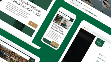 New website: Among the reasons for the redesign were available advances in web design to improve site performance, load time and interactivity, and a desire to more closely align the desktop, mobile and tablet experience in response to the increased use of the site on mobile devices.
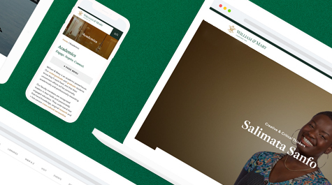 New website: The previous W&M website was designed in collaboration with creative agency mStoner in 2008 and has undergone several “refreshes” since. University Web & Design began planning for a full and true redesign of the site using its own team in 2018.
The William & Mary website is getting a new homepage, updated menus and search function and refreshed page designs — the first steps in outfitting the university with better, more flexible and varied tools with which to build webpages.
The upgraded virtual presence was done completely in-house by University Web & Design and will launch in phases. Completion of all phases of the project is expected next year.
“The university website has been due for a cleaner, more modern design for a while but a few key goals included improved usability and accessibility for visitors and elevated, enhanced, audience-specific content available from all pages within the site,” said Tina Coleman, director of University Web & Design. “We also reimagined the university homepage, which will communicate the value of a W&M education in a way we have not done before as well as feature one of the university’s greatest assets — the people of William & Mary."
Many of the team’s decisions including those around homepage and menu content as well as search features were data-driven, relying on user testing, web and search analytics and results from a recent university positioning study.
“One major change — the collapsed global menu — was guided by internal and external user testing,” said Coleman. “It will provide greater flexibility in presenting the most relevant options for our primary audiences, more dynamic search functionality, as well as more distinct presentations of department websites.”
The previous W&M website was designed in collaboration with creative agency mStoner in 2008 and has undergone several “refreshes” since. University Web & Design began planning for a full and true redesign of the site using its own team in 2018.
Among the reasons for the redesign were available advances in web design to improve site performance, load time and interactivity, and a desire to more closely align the desktop, mobile and tablet experience in response to the increased use of the site on mobile devices.
“Over the years we have observed that traffic into www.wm.edu via secondary (non-homepage) pages has increased and homepage visits have decreased,” said Justin Schoonmaker, creative director and brand strategist. “More people than ever are entering our site without ever seeing our homepage, and we have endeavored for our approach to navigation and content to reflect that reality by leaning more heavily on features that are available site-wide.”
The team followed guiding principles that included cleanliness of design and code, flexibility and modularity, modernization, support of existing content, improved accessibility and a more experiential global navigation that highlights major themes of the W&M experience.
The new design offers enhanced interactivity through the use of ambient video and site-wide animations, and is intended to optimize a visitor’s experience and the site’s performance.
“To give our web editors more flexibility, we’re moving away from custom page templates toward independent, reusable blocks of content that can be stacked and arranged on multiple pages,” said Mark Windley, associate director of web development. “In our case, these reusable blocks will be edge-to-edge rows with a defined purpose and a simple editor interface. The more rows we create, the more custom possibilities we provide all our editors. The added challenge was to introduce this functionality in our current structure, without disrupting the existing content. We’re pleased with this release and looking forward to the next phases.”
In the coming months, the plan is to build a library of rows for creating more visually engaging pages.
